The client
A Sudanese company focused on local production of the finest natural milk.
The brief
The company sought a visual upgrade for its brand. The goal was to revamp every touchpoint, from packaging through to interior design, around a fresher and bolder typography.
Process
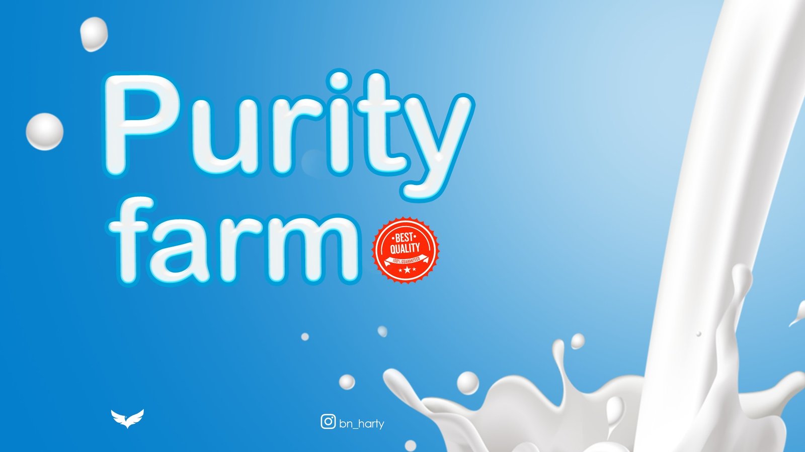
I modernised their main symbol and built a system of branded illustrations to harmonise with the updated typography. A stylised series of photographs extended the upgrade to social media.
The range
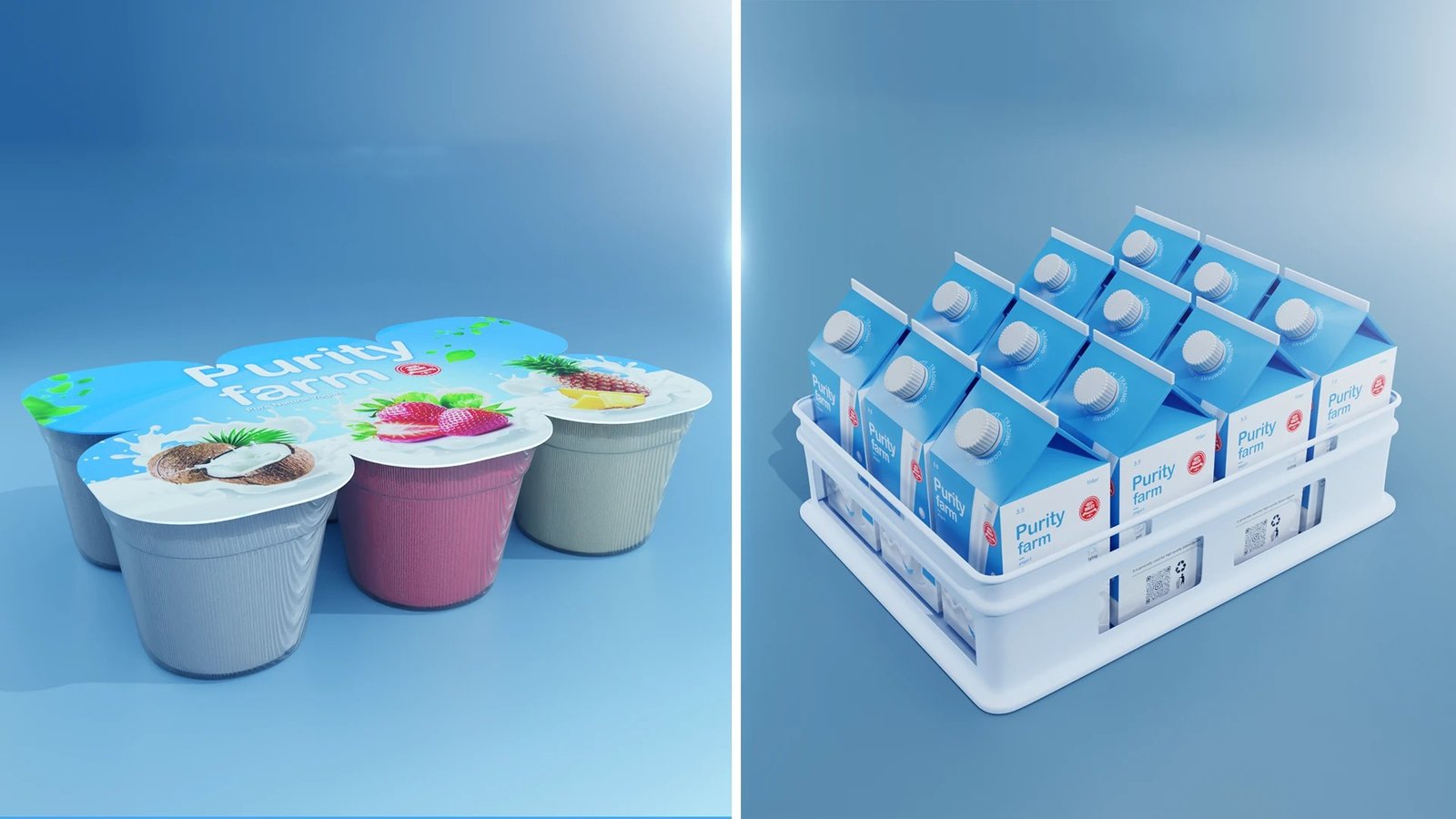
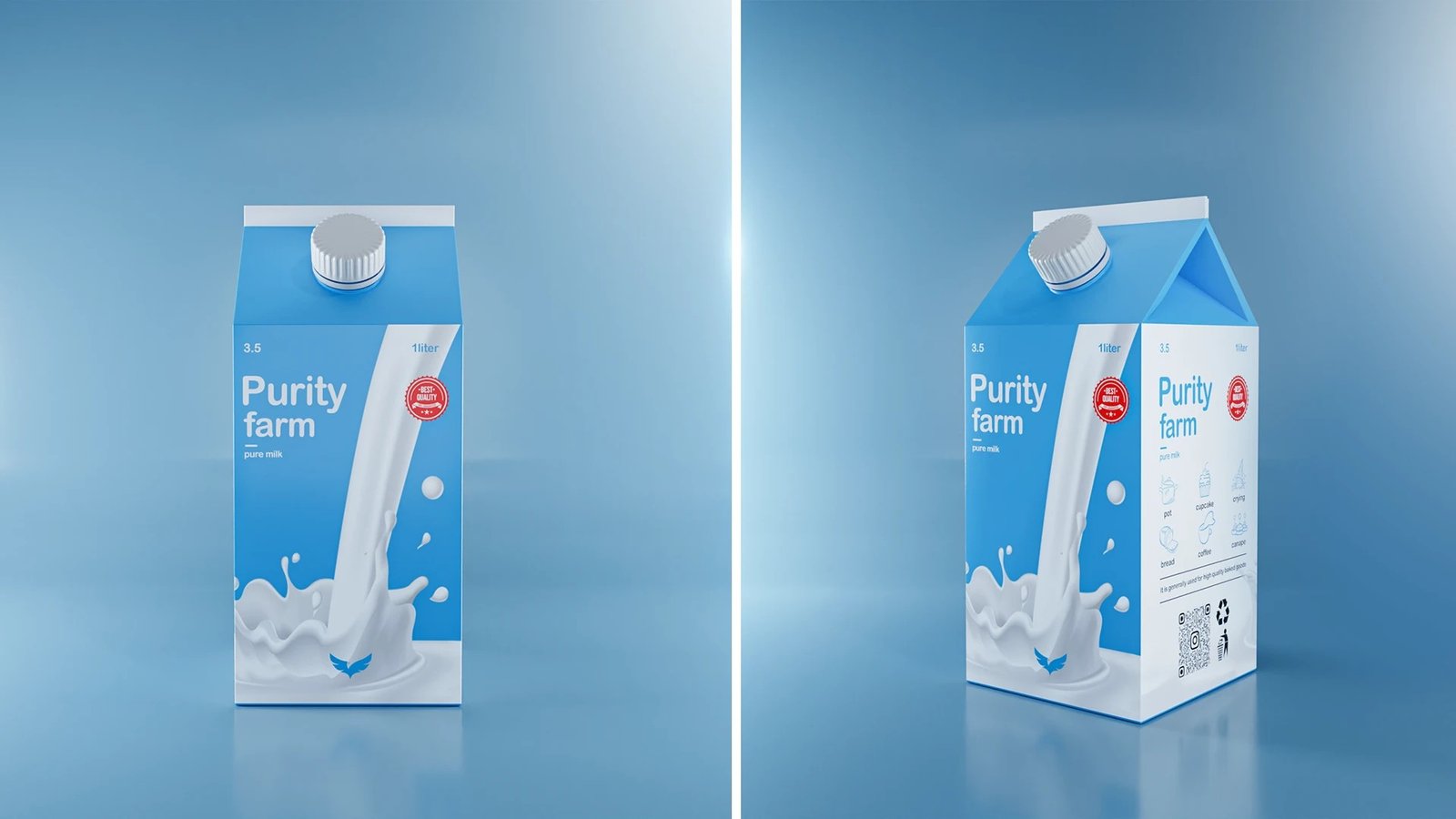
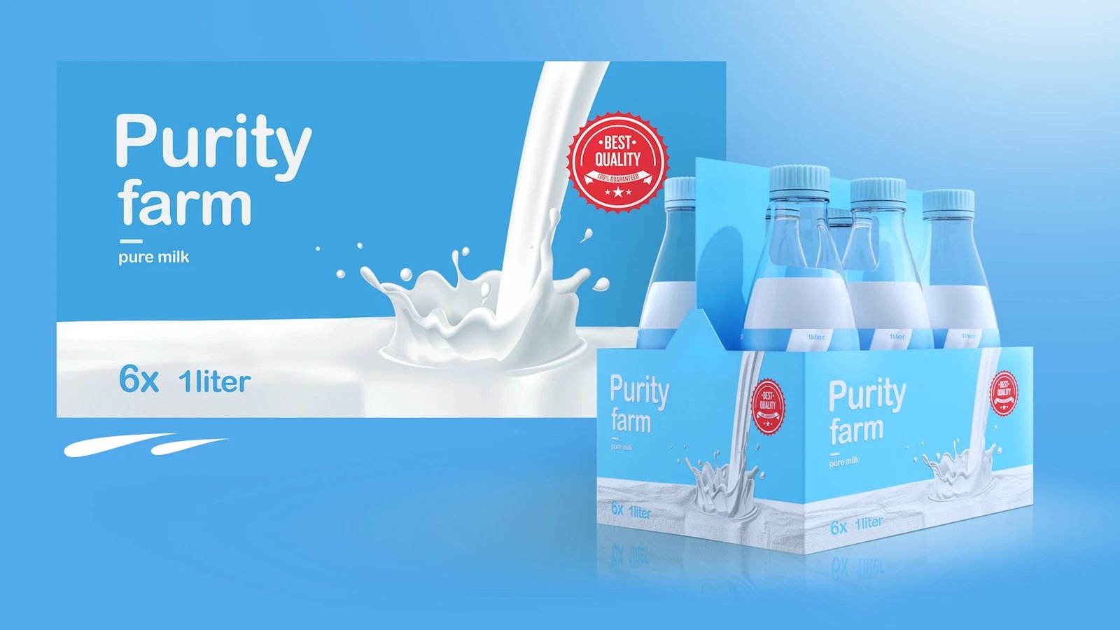
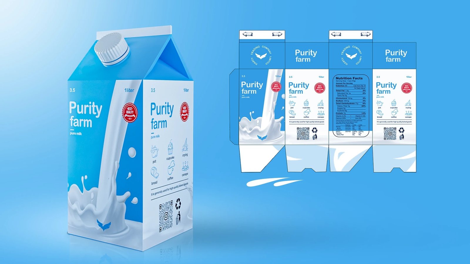
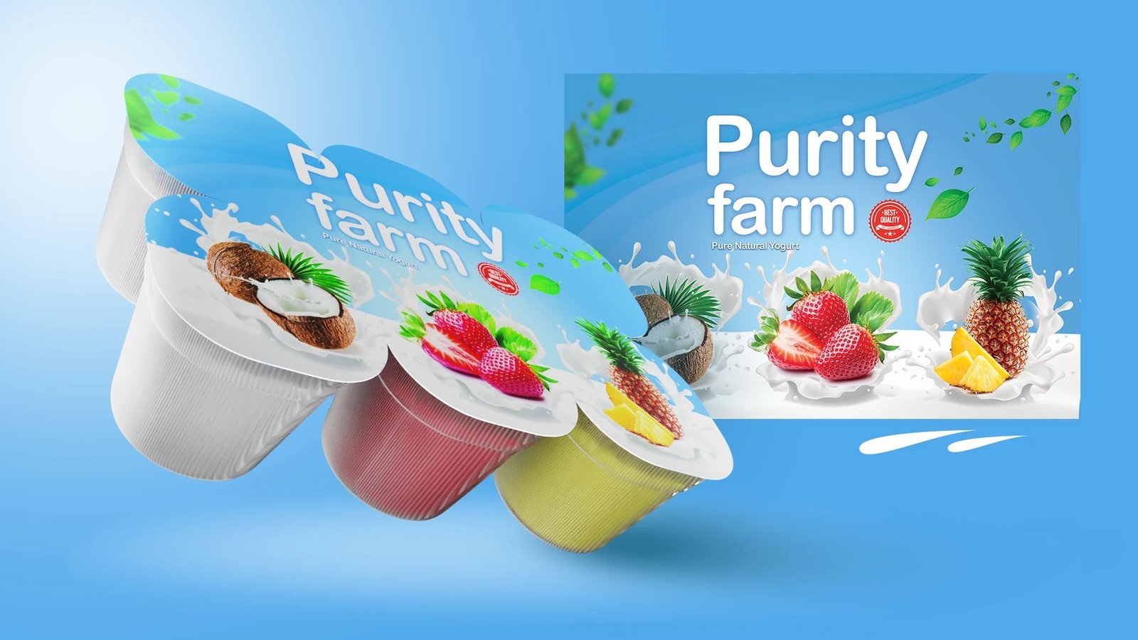
The system had to stretch across a family of products: pure milk in one-litre bottles, carton packs in a delivery crate, and yogurt cups in coconut, strawberry and pineapple. One blue, one wordmark and a red Best Quality seal hold them together.
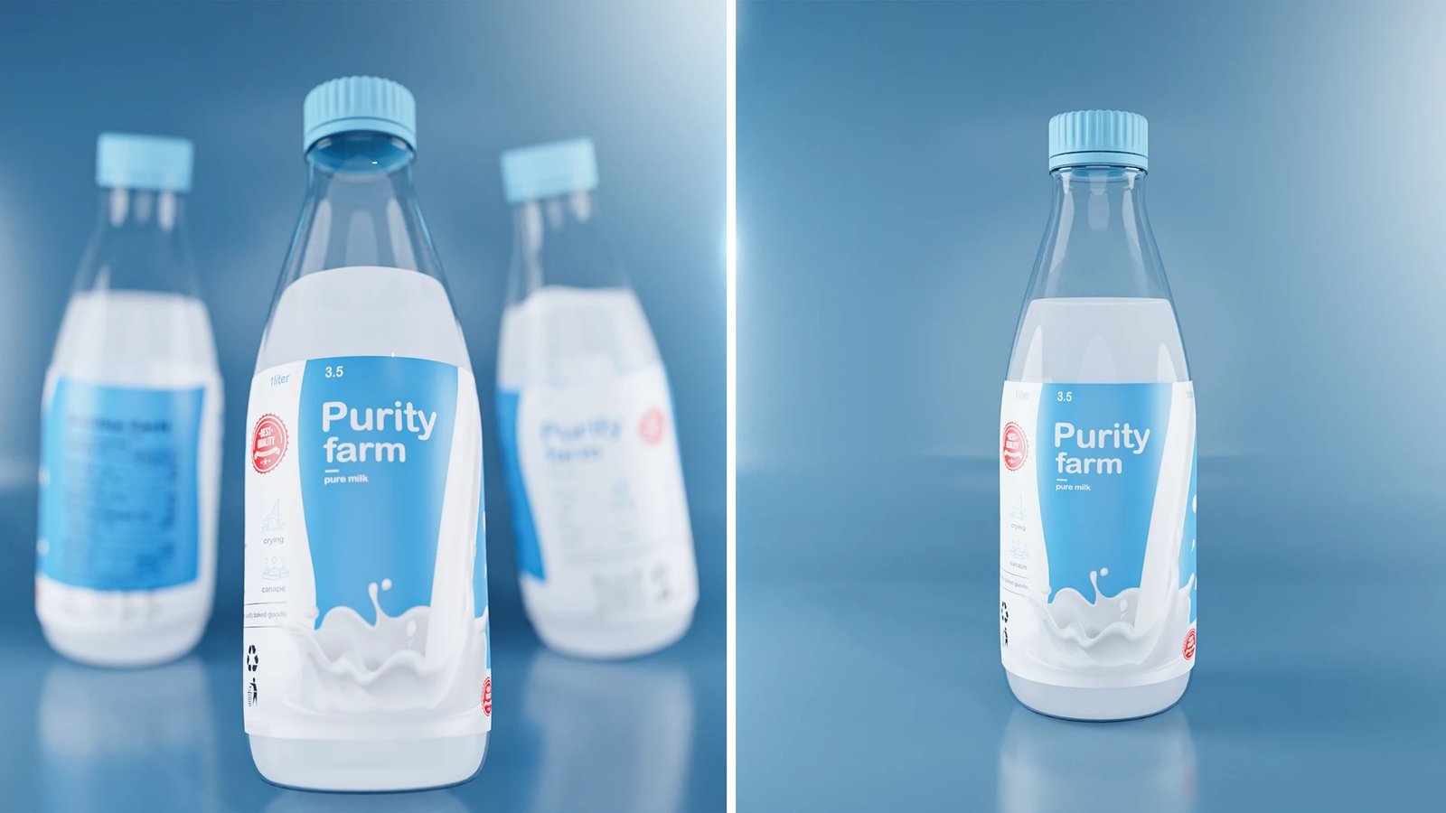
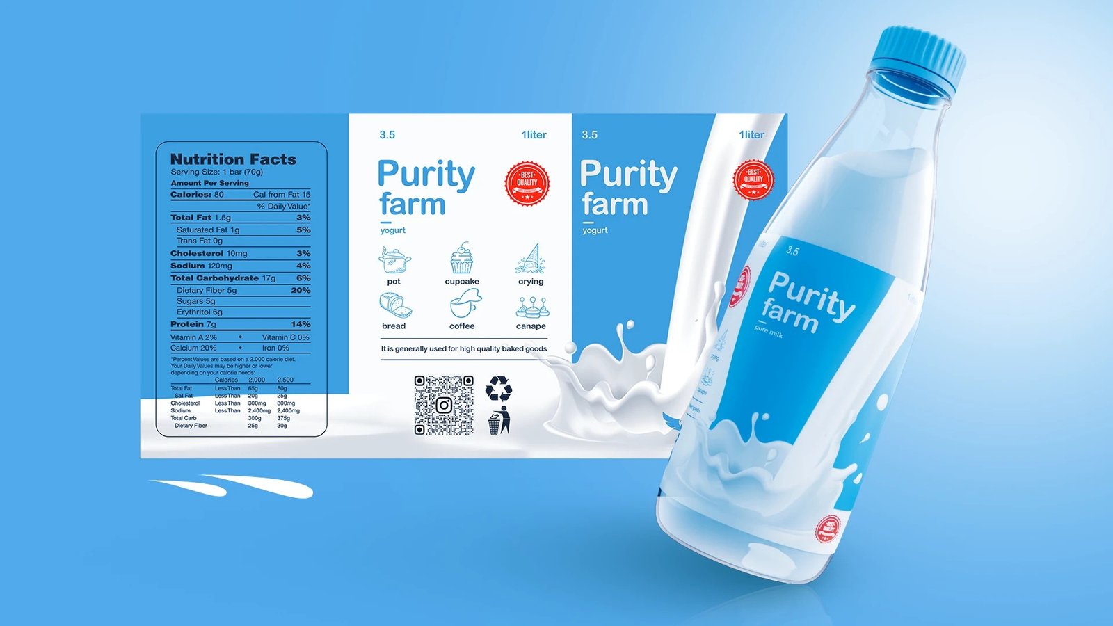
The bottle label was designed flat and complete: the 3.5 fat content up front, a full nutrition facts panel, usage icons for the kitchen, a QR code and recycling marks. Everything was then modelled and rendered in 3D, including the hero shot of the bottle landing in a splash of milk.
Outcome
A visually enhanced brand identity spanning several touchpoints, a modernised symbol, branded illustrations and new visuals, positioning the natural milk product at a new level, in line with their commitment to quality and local production.
The pack
Clear glass bottles with pale blue caps, so the product itself supplies the white in the palette. Purity farm is set on a blue band with 3.5 marking the fat content, a red seal to the left, and a milk splash illustration breaking the bottom edge of the label.
Project details
- Client Purity Farm
- Year 1 October 2022
- Scope Brand, label and 3D
- Deliverables Symbol, packaging and label design, 3D product renders, branded illustration, social photography