The brief
A rebrand for Hippocrates Medical Enterprises, delivered through PentaQon's media department. The brand had to capture the company's mission and resonate with its audience.
Process
I started with background research on the company and its products, then built a mood board to guide the design decisions. From there came a logo, and a design system covering colours, fonts and graphics for all branding and marketing material.
Guidelines
I produced a visual identity guidelines document setting out how to use the logo, colour palette, typography and imagery, so everyone in the organisation applies the branding consistently. It comes with a plan for maintaining the identity over time, reviewing the visuals periodically and keeping materials current.
Logo meaning
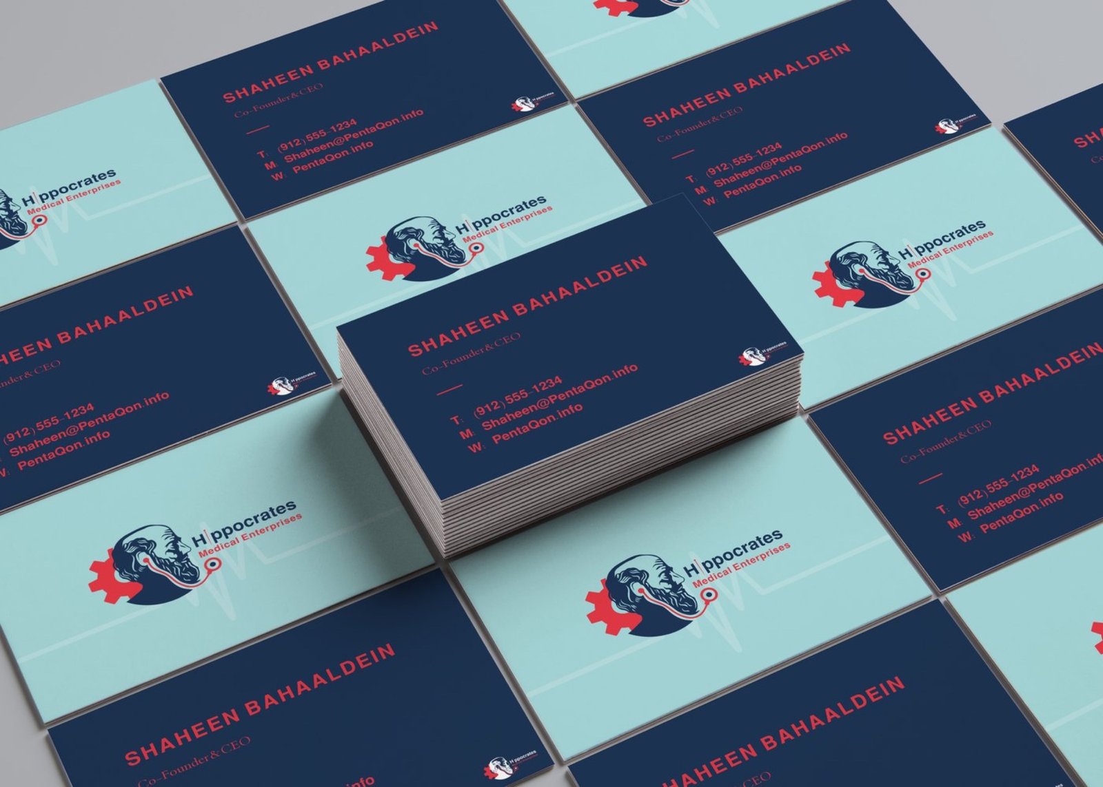
The name refers to the Greek physician known as the father of medicine, so his profile sits at the centre of the mark. Around it, a gear stands for goals, engagement, accountability and results. A needle stands in for the letter I in the wordmark, and a telemonitor shape points to modern monitoring equipment and patient care.
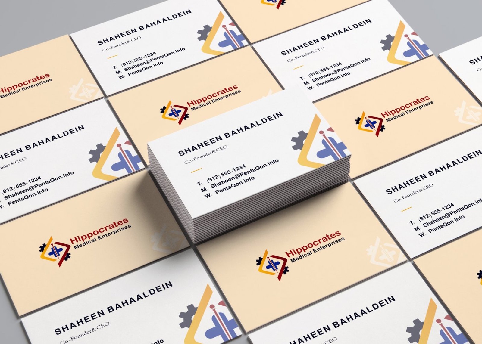
Two further routes were explored. One drew on the theory of the four humours, with a palette taken from it. The other drew a heart as a chemical structure, in blue at the client's request.
Colour and type
Dark blue #1D3557 for calm, responsibility and reliability, with amaranth red #E63946, named after a flower long used in medicine. The Arabic is set in Mohammad Naskh, chosen for its round edges and the absence of hard ends, so it sits comfortably beside the symbol.
Tools
Photoshop and Adobe Illustrator.
Project details
- Client Hippocrates
- Year 27 May 2020
- Scope Brand design
- Location Dubai
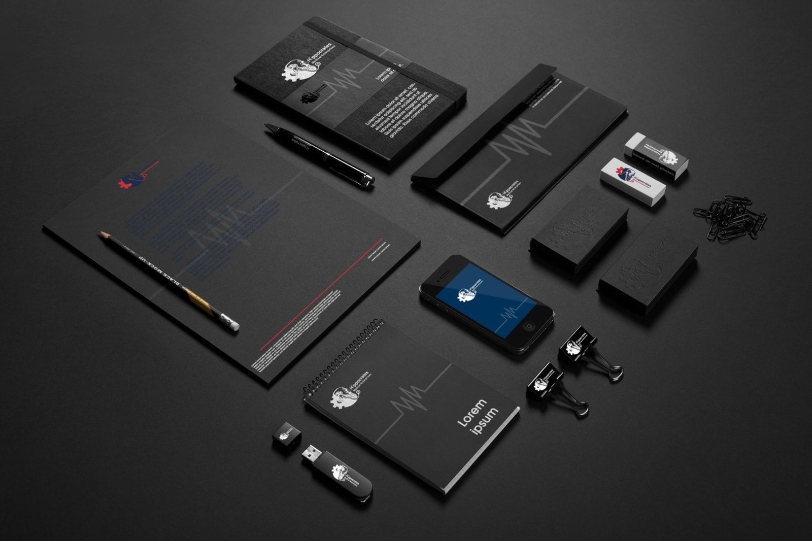
- Deliverables Logo, design system, identity guidelines, stationery