The mark
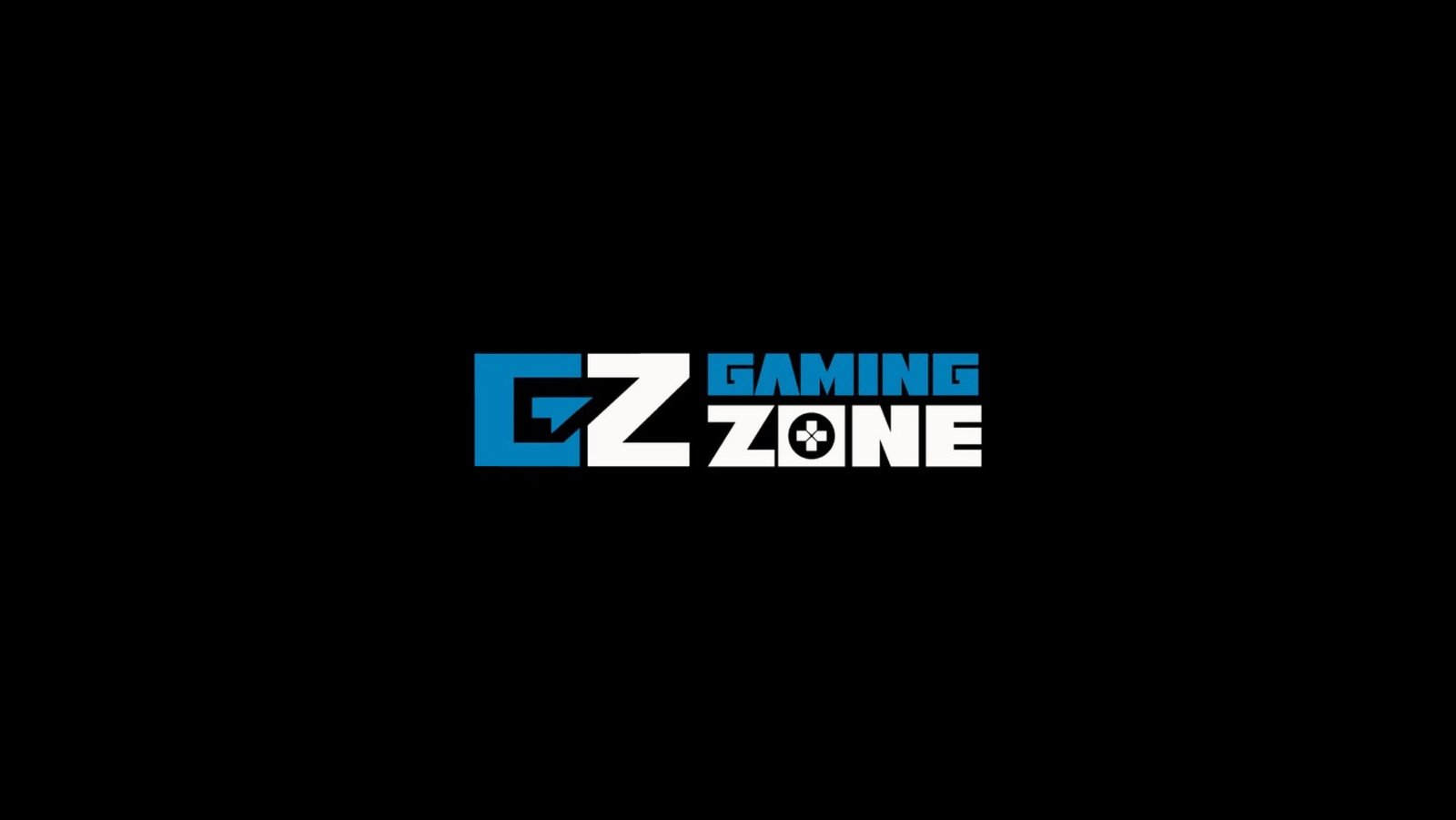
A GZ monogram cut on a diagonal in cyan against white. The diagonal does the work: it gives the letterforms motion without adding any element that is not part of the letters themselves.
Lockups
A stacked GAMING ZONE version for square placements and a horizontal one for headers, both drawn from the same monogram.
Details
The O in ZONE is drawn as a game controller's directional pad, the one detail that tells you what kind of zone this is. Blue and white on black, the mark was tested on keyboard keycaps, a fitting place for a gaming brand to live.
Options
Developed as a set of alternatives for selection rather than a single proposal.
Project details
- Client Gaming Zone
- Year 2023
- Scope Logo design
- Deliverables Logo, logo options