Logo meaning
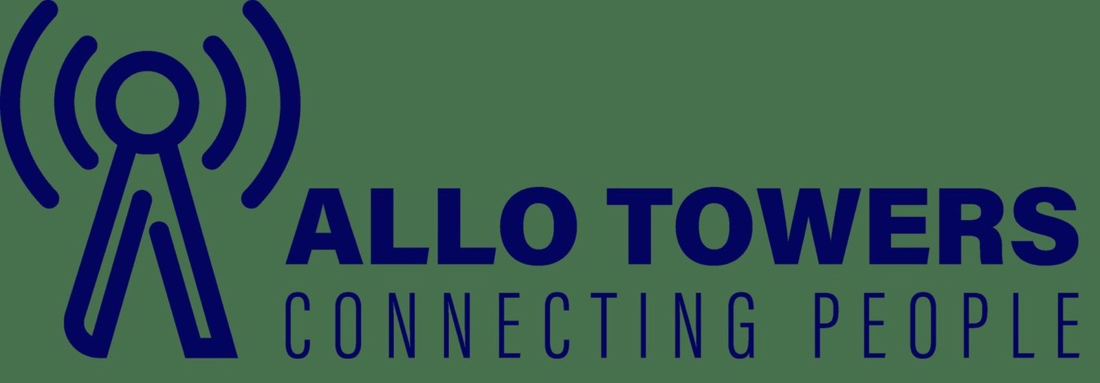
The concept page names four ideas inside one symbol: a shape for people, a shape for signal, the letter A of the name, and two hands trying to connect. Together they draw a transmission tower, which is the business, and a meeting, which is the promise in the slogan Connecting People.
The mark
A lattice tower emitting three signal arcs, with ALLO TOWERS set above the line CONNECTING PEOPLE. The arcs are drawn at even intervals so they read as transmission rather than decoration.
Colourways
Shown in navy and in orange, both against green. The tower is a line drawing in both, so the colour change does not alter the weight of the mark.
Brand device
The signal arcs are lifted out of the symbol and used large as a graphic device, on presentation pages and on pole-mounted signage, so the identity can be recognised from the arcs alone.
Project details
- Client Allo Towers
- Year 2022
- Scope Logo design
- Deliverables Logo