The name
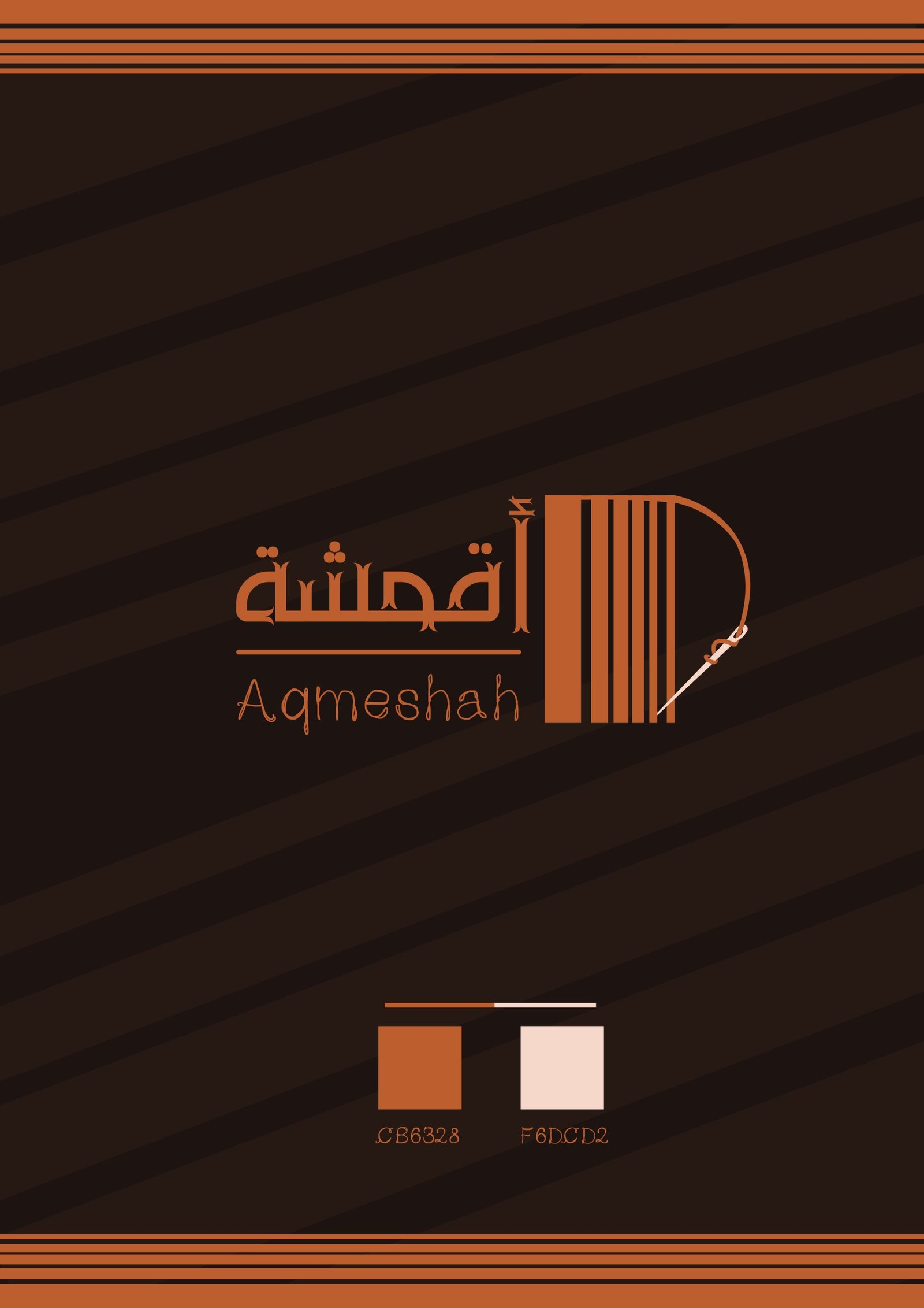
Aqmeshah is the Arabic word for fabrics, so the name is the product. The job of the logo was to make that obvious in both scripts, to customers who read Arabic first and to those who read the Latin spelling.
The mark
The symbol is a bolt of cloth seen from the side: vertical bands of different widths, like the threads of a weave or fabric rolled on a bolt, closed by a single curve. A needle pulls a thread through the end of that curve, which turns a roll of material into something being made.
Wordmark
The Arabic name is drawn with small ornamental cuts on the letters, closer to tailoring marks than to calligraphy, and sits on a rule above the Latin name, set lighter and wider so the two never compete.
Colour
Two colours only: burnt orange #CB6328 and a pale blush #F6DCD2, used on a dark brown ground with woven stripes. The orange reads as copper thread, which is how the mark was finally shown: embroidered on black cloth beside a spool of the same thread.
Project details
- Client Aqmeshah
- Year 2019
- Scope Logo design
- Deliverables Bilingual logo, symbol, colour palette, mockups