The mark
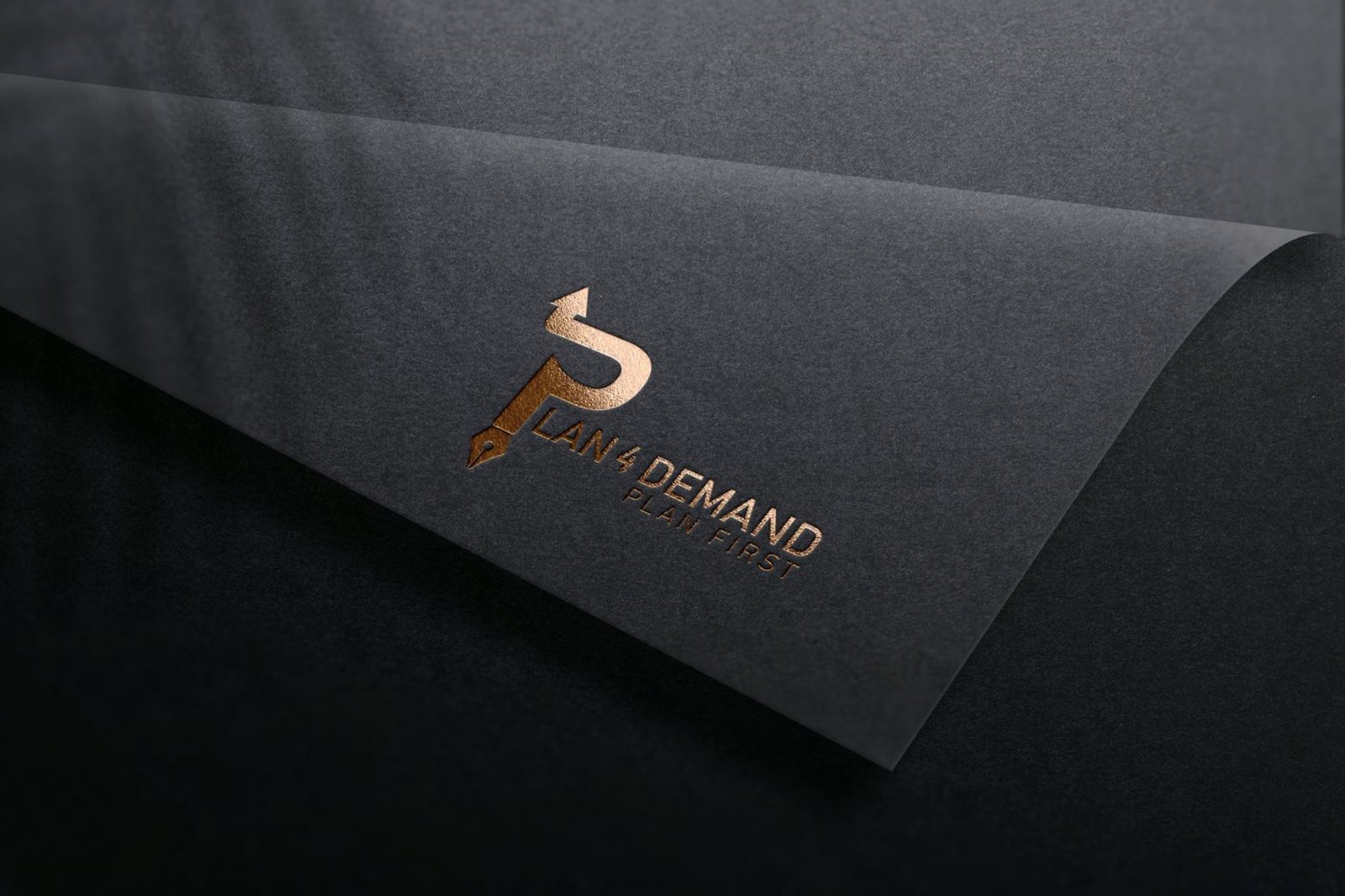
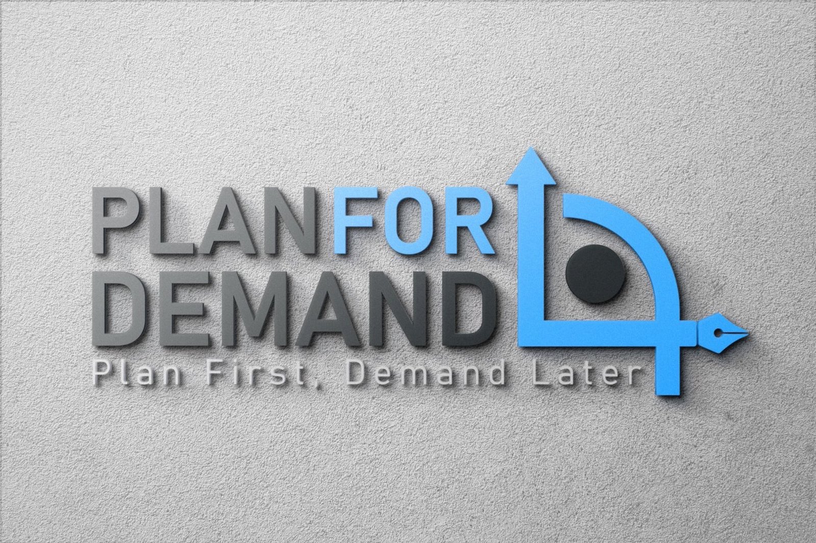
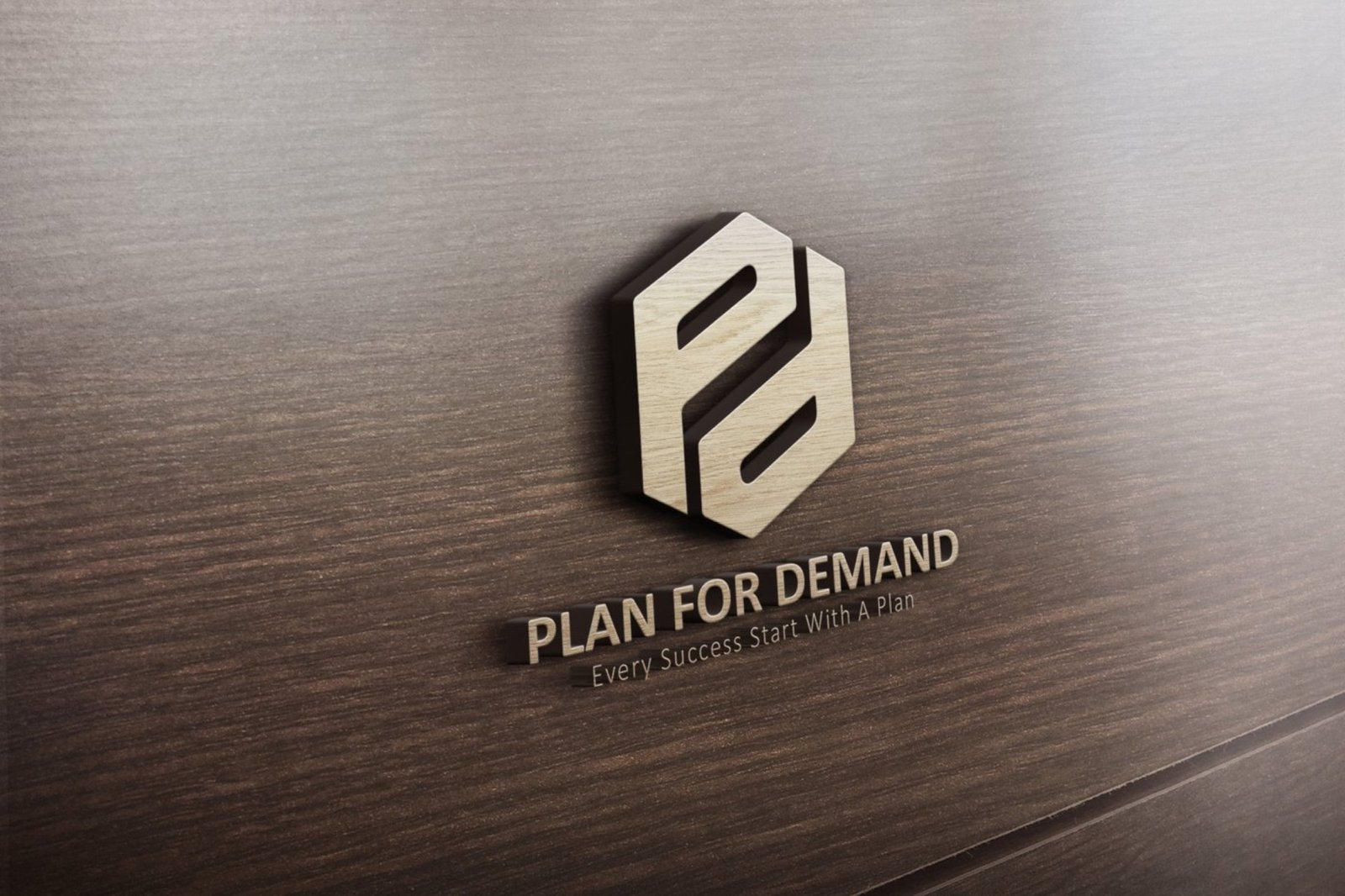
A monogram folding P and D into one continuous ribbon, drawn so the two letters share a stroke rather than sitting side by side. A separate horizontal lockup reads PLAN FOR DEMAND above the line Plan First, Demand Later.
Brand guidelines
The identity ships with a 22-page brand manual dated April 2023. It opens with the company itself: a mission to plan for demand proactively and strategically while staying customer-centric, a vision of becoming the leading demand planning company, and four attitudes that the brand has to carry: proactive, strategic, innovative and adaptable.
The rest is the rulebook: the logo and its elements, clear space and minimum sizes, incorrect uses, colour and typography, all under the line Plan First, Demand Later.
Process
Two full proposals came first, then a round of other ideas and separate font and colour studies, before the final monogram was chosen.
Finishes
The mark is presented three ways, each testing a different property. Gold foil on black textured stock tests it as a reflective surface. Dimensional lettering on concrete tests it as an object with a cast shadow. Gold on wood tests it flat. A monogram this tightly interlocked can close up under any of those, which is what the three treatments are checking.
Stationery
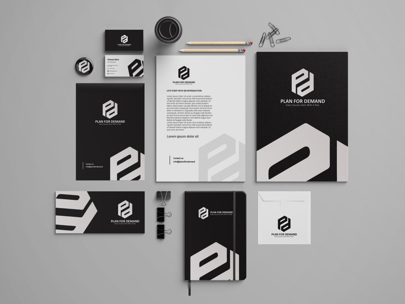
Cards, letterhead, folder and notebook, set in black, white and grey so the gold is the only colour anywhere in the system.
Project details
- Client Plan 4 Demand
- Year 2023
- Scope Identity and brand guidelines
- Deliverables Logo, brand guidelines manual, foil stationery